Add an About Box to a React App
Add an About box to a React app once and manage its version, author, license and links from the AboutTheApp dashboard. Here's how, step by step.
Live example
This is the About box of AboutTheApp itself. Switch the variant to see other layouts. The code below renders exactly this box. For your own app, change the alias.
<script src="https://aboutthe.app/embed/web/0.3.5/card.js" integrity="sha384-X3VGSEdTNGsfVKfVUx7sq9ICfpWsJW88HDQYidGPio1KjoxYCbSirTNqtbVfq1sj" crossorigin="anonymous" async></script>

<about-the-app alias="aboutthe.app" variant="card" api-base="https://aboutthe.app/api/v1" visual-style="default" palette="default" appearance="auto"></about-the-app>
Where the About box gets its data
None of the About box's content is configured in your React code. Its content — name, logo, version with its release notes, author, license and resource links — comes from the AboutTheApp dashboard. Your app only references it. What else belongs on an about screen is covered in About Screen for Your App.
The Integrate panel on the product card in the dashboard has the same code as the live example on this page, already filled in with your app's alias, so you can just copy it.
Adding it to a React app in 5 steps
The About box is a Web Component (a custom HTML element), so React renders it like any other tag — no library or wrapper component needed.
React itself needs no configuration — but if your project uses TypeScript, JSX won't recognize an unknown custom element by default. The about-the-app.d.ts file declares its properties (alias, variant, unlock-code and more), so both the compiler and your editor's autocomplete understand it.
- 1
Create your product
Create it in AboutTheApp (or open an existing one) and note its alias — you'll find it in the product editor and in the Integrate panel.
- 2
Load the widget script
Add the script <script src="https://aboutthe.app/embed/web/v1/abouttheapp.js" async></script> wherever your app already loads third-party scripts — index.html or via next/script if you're using Next.js. The code in the live example and in the Integrate panel points to an exact script version and includes the integrity attribute.
- 3
Place the tag
Add <about-the-app alias="aboutthe.app" /> wherever the box should appear — the footer, the Settings screen or a Help/About menu item.
- 4
Add TypeScript types (optional)
Download about-the-app.d.ts and drop it anywhere in your project so JSX recognizes the tag and its attributes.
- 5
Fine-tune the appearance
Choose the layout with the variant attribute: card (default), footer, compact, dialog, support, version, maker, credits or link. Set the look with visual-style, palette and appearance. Add lang, show-border, customer-alias, version, unlock-code and always-show-private as needed.
Show the version your app actually runs
Without the version attribute, the box shows the version recorded in AboutTheApp: the product's current version or with customer-alias the version of that customer's primary deployment. If nobody records a new release, the box keeps showing the old number.
With the version attribute, the box shows exactly the value you pass, typically the version from your build. Its release notes appear only if the same version (exact, case-sensitive match) exists in the product's version catalog and is public or is private and the About box is unlocked with an unlock code. Otherwise the box shows just the number. The Integrate panel has no setting for this, so add the version attribute to the copied code yourself.
import pkg from "../package.json";

export function AppFooter() {
  return <about-the-app alias="aboutthe.app" version={pkg.version} />;
}
Example result
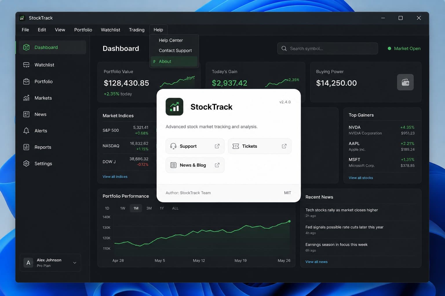
The About box always shows live data: the version, author, license and resource links the product owner has published.
Frequently asked questions
Does the About box work without React?
Yes. The About box is a standard Web Component, so it works in Vue, Angular, WordPress, a static site or any page that can load a script and render an HTML tag. The integration is the same everywhere: one script and one about-the-app element.
Do I need to change my app's code when About box links or details change?
No. The About box loads its data from AboutTheApp every time it's displayed, so an updated link, description or changelog shows up without a code change or a new deployment. The version number works differently. Record each new version in the dashboard or from your CI/CD pipeline. The other option is to pass your app's own version in the version attribute. Release notes for that version still have to be in the version catalog.
Can the About box show the version a specific customer runs?
Yes. Add the customer-alias attribute with the customer's alias from the dashboard. The box then shows the version of that customer's primary deployment instead of the product's current version. If you also set the version attribute, it takes precedence over the customer's deployment.
Does the About box use cookies or tracking?
No. The About box sets no cookies and uses no analytics. It only stores a token from a previous unlock in sessionStorage, never the unlock code itself.
How do I show private links only to some users?
Private resources are hidden unless the visitor has the unlock code. You can render the unlock-code attribute only for selected roles in your app or let users enter the code themselves in the box. With always-show-private, private resources stay visible as locked tiles.
 AboutTheApp
Ready to add your own About box?
Create a free AboutTheApp product and get your integration code right away.