
Add an About Box to a React App
Have a React app and want aboutthe.app info right inside it? Besides adding a link or wiring up the API by hand, there's a third option — drop in a ready-made About dialog, the About box.
Overview & context
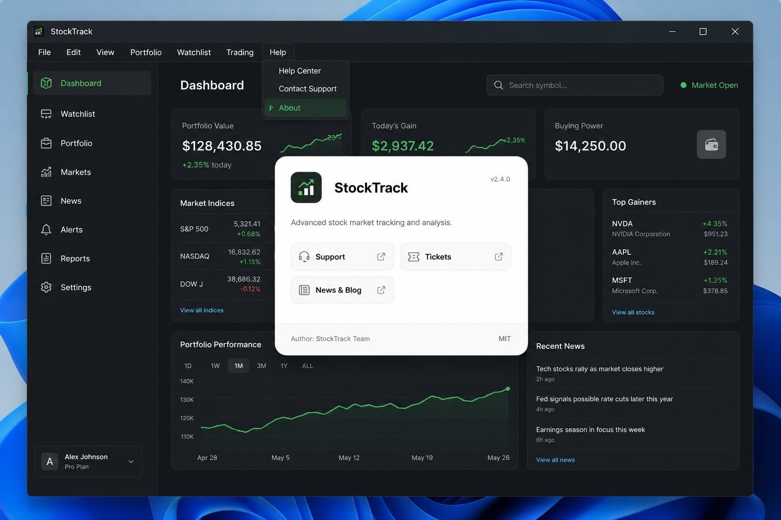
The About box is a small embeddable widget that shows your app's version, author, license and resource links — you add it to your app once, then control its content from your product's admin in aboutthe.app.
Where the About box gets its data
None of the About box's content is configured in your React code. Its content — name, logo, version, author, license and resource links — comes from the aboutthe.app dashboard, the product editor. Your app only references it.
The same editor's "Add to app" panel has other integration options, including the exact steps below — already filled in with your app's alias, so compared to this guide you can just copy the ready-made snippet.
Adding it to a React app in 5 steps
The About box is a Web Component (a custom HTML element), so React renders it like any other tag — no library or wrapper component needed.
React itself needs no configuration — but if your project uses TypeScript, JSX won't recognize an unknown custom element by default. The about-the-app.d.ts file from the integration panel declares its properties (alias, theme, unlock-code and more), so both the compiler and your editor's autocomplete understand it.
- 1
Create your product
Create it in aboutthe.app (or open an existing one) and note its alias — you'll find it in the product editor's URL and in the "Add to app" panel.
- 2
Load the widget script
Add the script <script src="https://aboutthe.app/embed/web/v1/abouttheapp.js" async></script> wherever your app already loads third-party scripts — index.html, or via next/script if you're using Next.js.
- 3
Place the tag
Add <about-the-app alias="my-app" /> wherever the box should appear — the footer, the Settings screen, or a Help/About menu item.
- 4
Add TypeScript types (optional)
Download about-the-app.d.ts and drop it anywhere in your project so JSX recognizes the tag and its attributes.
- 5
Fine-tune the appearance
Adjust the optional attributes — theme, show-border, unlock-code, customer, environment — depending on how you want the box to behave in your app.
Example result
The About box always shows the same live data: the current version, author, license and resource links the product owner has published.
In short
Your React app only needs one script line and one element. Once the About box is added, every future change — a new version, a new resource link, an updated changelog — shows up automatically, with nothing to change again in your own app.
Ready to add your own About box?
Create a free aboutthe.app product and get your About box integration snippet right away.